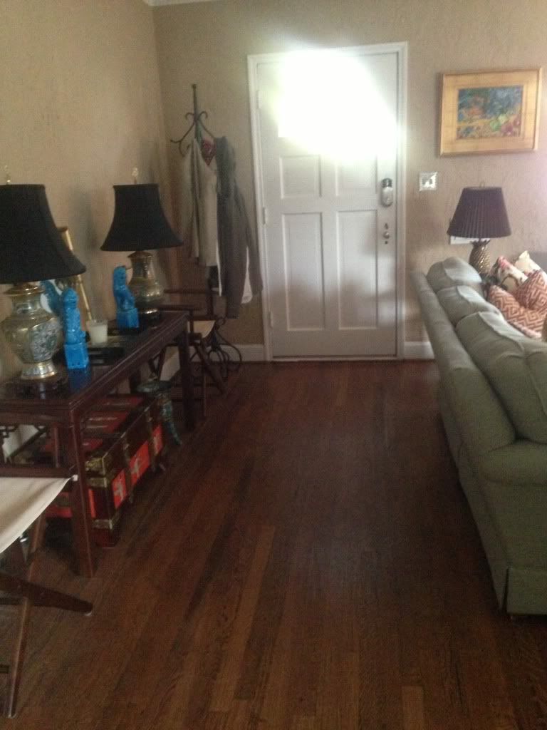
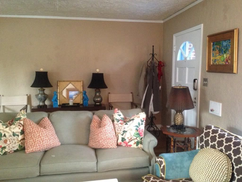
When it comes to your home, the entryway space is probably the first impression of your interior. Why not make a fabulous statement? In our home, when you come through our front door, you essentially walk in to our living room. The door swings open to a wall just to your right and you walk into what seems to be an "entryway" because the back of the couch sections off the seating space to your left. We basically have a long wall that is my ever-changing project. Here's what we're working with:
Excuse the coat rack. I hate it. Steven thinks it's neccessary. It's got to go.
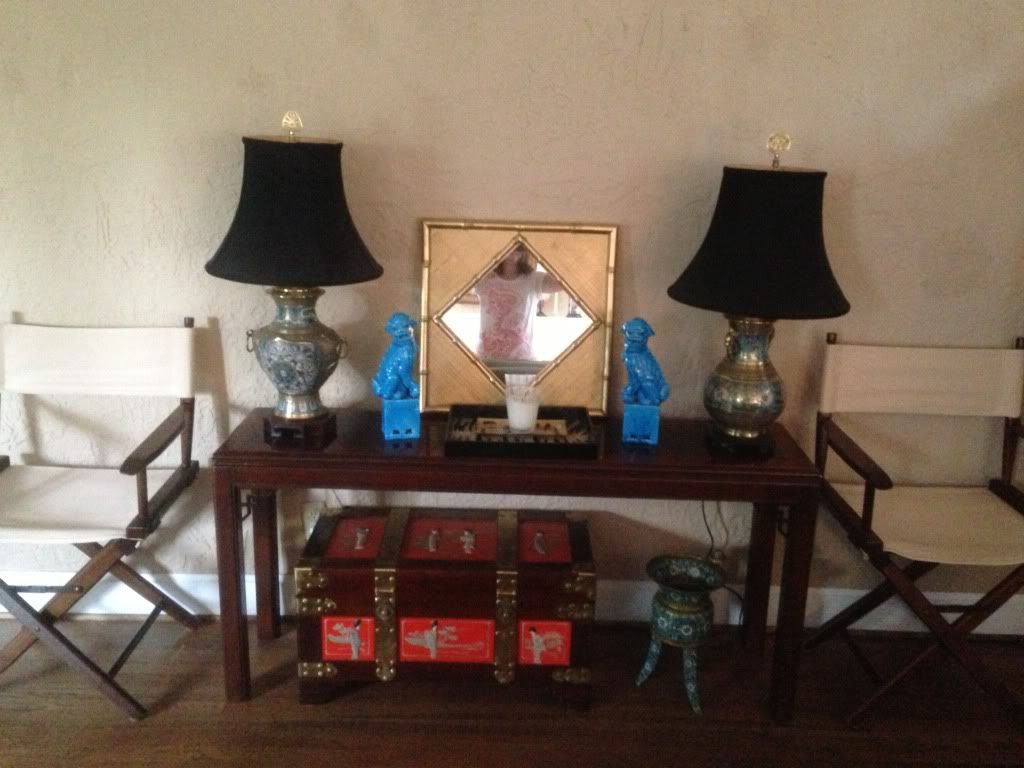
We had to offset the trunk with that planter for now because the trunk is hiding a cable hole in our wall. The previous homeowner had the DVR/etc against this wall. A friend of ours will hopefully fix it soon so I can center my chest.
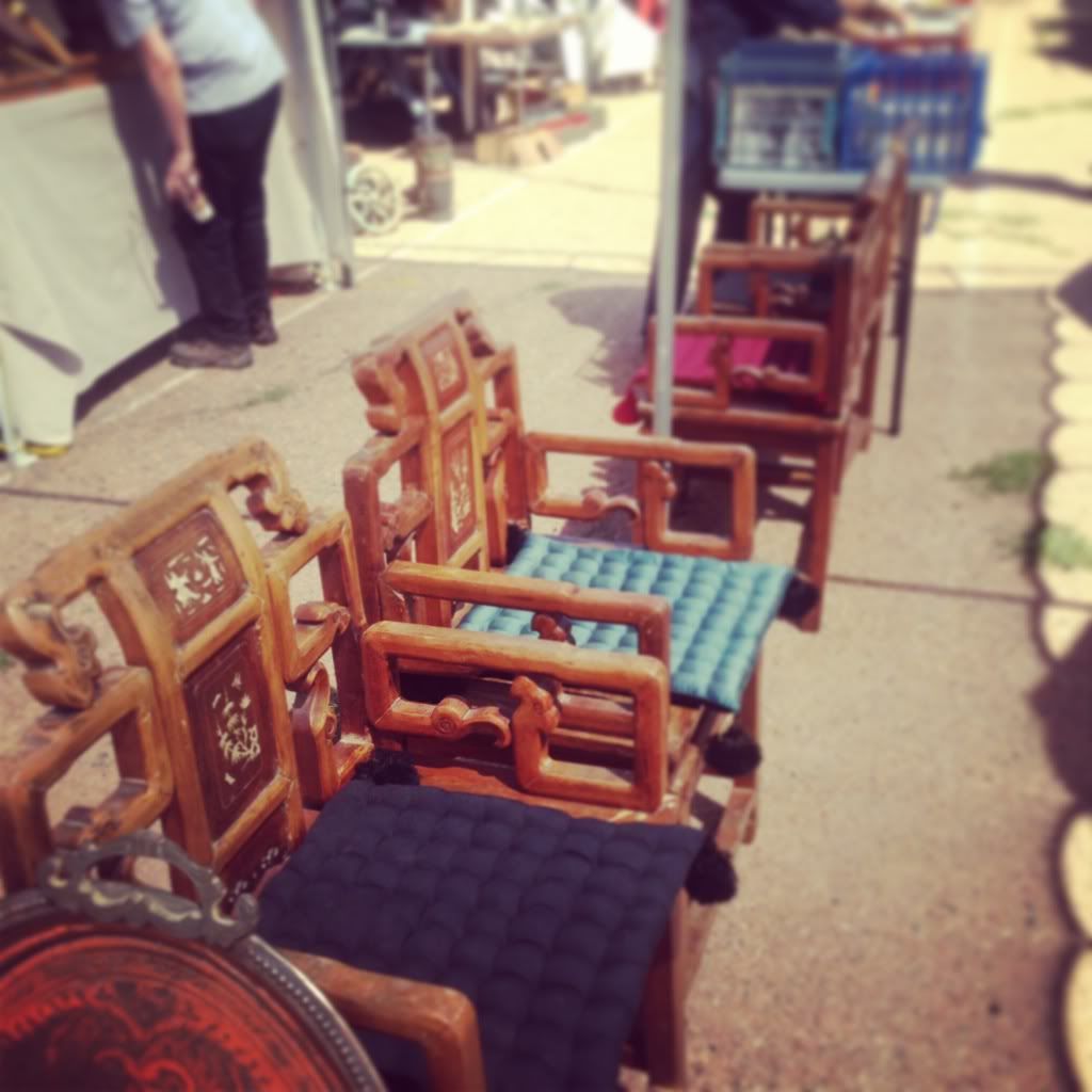
Now, these chairs would have been AWESOME. However, at a flea market, they were still over 1k.
Obviously, a work in progress. Design takes TIME (and money, duh). I patiently and LUCKILY scored the Drexel table and the vintage Asian chest from local antique shops and the cloisonne lamps were my late grandmothers. They were sitting on our bedroom dresser up until a couple of months ago when I found a table. Undies in the den. How fun. Anyway, I had them rewired, shined up and I bought new shades prior to moving out here. I love that they're not exactly matching. I'm undecided on keeping the director's chairs in this space, but at the time, that's the only room in this house that they fit (unless I fold them up and stuff into a closet). They're from Pier 1 and I got them for additional outdoor/dining seating the event we have more than one other couple over. Not really my favorite chair to add to the dining room, but they're totally multifunctional and I love a classic director's chair. I'm totally getting the seat backs monogrammed.
It's kind of coming together, but so not near done! First things first- let's discuss the fact that there are textured walls (throughout our entire house, btw. ugh) and I'd like to have a painter come in and smooth it all out and repaint. That's a major investment, so this is going to have to do for now. However, one wall wouldn't be so bad if it was an accent with wallpaper. But, is that a good idea? Or would that be too much/too busy with everything else happening in our house? Secondly, I'm in desperate need of a large (gold, round?) mirror! I'm constantly on the hunt for one at a good price point, but I haven't found one I love. Thirdly, I need to sort of figure out how to balance things out on the table in the space between the lamps and then I'll need to fill the wall space on either side of what would be a mirror in the center. Unfortunately for the house, we're traveling SO much in the upcoming weeks/months, that I'm not sure when I'll get to get the ball rolling. I've scoped out my ultimate favorite entryways that look to be comparable to give my eyes something to feast on in the meantime.
First up, I DIE. This, my friends, would be my dream entryway. Yep. After like 6 years, I'm still not even over the Chiang Mai Dragon, so let's do this. It's everything. Frankly, I feel like my existing objects could just ease right into looking fab with this backdrop. The rest of the room? Eh? We may have to spruce up some pillows, but that's alright. I'm sure in 5 years after I've saved all my pennies for the wallpaper, we'll get to it. But by then, we may be ready to move again, and guess what? That wallpaper can't come with. What a bust. So....framed panels...let's hold on to that idea...
In this space, I love the wallapaper look again. Also, note: sconces + lamps. Round mirror, massive foo, and flanking chairs. Simple accessories on the credenza. The bright colors and fresh white are making me very happy.
When it comes to an entry space, a mirror is totally key for taking a last look before walking out the door. Gotta check the hair, y'all. I love this fancy mirror, but I know that I want a gold one. I feel like the white works in this space because there's alot going on with that giant orchid, but I love this look. Whenever I add in choctchkies to a space, somehow I make it look cluttered, whereas this one comes off as balanced. Perhaps it's because of the simple wall and the pops of white.

While this space is a bit coastal for my current style, I appreciate the gallery wall and the artwork flanking along this really long wall, like mine. I also like the corner plant, and the styling on the table. I'm afraid that much artwork would be too much because we have artwork on the opposite wall, but I do like the use of space here.
Um..these lamps are just amazballs. So is that table. And the tufted ottoman on top of the zebra...wow. So, I appreciate the artwork here, but like I said, I need a mirror!
This very well may help me with my chotchkies issue. Flanking lamps, stacked books that stay within a color scheme, a skinny vase, and I LOVE the presonal touch with photos. My table is pretty narrow, so I could attempt this and end up with less going on because there isn't even that much room. I'd skip the artwork and go with a mirror. That greek key detail on that table is perfection.
I think those are some pretty fabulous photos to draw some inspiration. What would you do in this space?
I'll be sure to update if we ever make headway. I also still need an area rug for the living room. Designing in my own abode is sadly taking a backseat, but I can't even complain. I've got a roof over my head and much to look forward to :) Counting my blessings, but isn't it annoying funny how design can just nag at you?! And how ironic is it that you find the PERFECT rug on Joss&Main (only 2 left and 1 more day to buy!) when you just DO NOT have the funds to pull the trigger? I digress.
xo,
SugarMeg

